Mobelux Provided:
In 2008, iHome had emerged as the leading manufacturer of hardware that connected with Apple products. It was a wildly exciting industry to be in, with iPhone mania poised to really blast off. iHome’s name was getting bigger, and all was bumping along at a solid pace. But they kept coming back to this one idea that they hadn’t quite found a way to implement.
iHome wanted to release an iOS alarm clock app that would communicate with its hardware. Something simple and accessible, and something that made sense. What they envisioned didn’t exist as of yet, but iHome knew it would be a big deal once it did. And they wanted to make sure they’d be on the cutting edge.
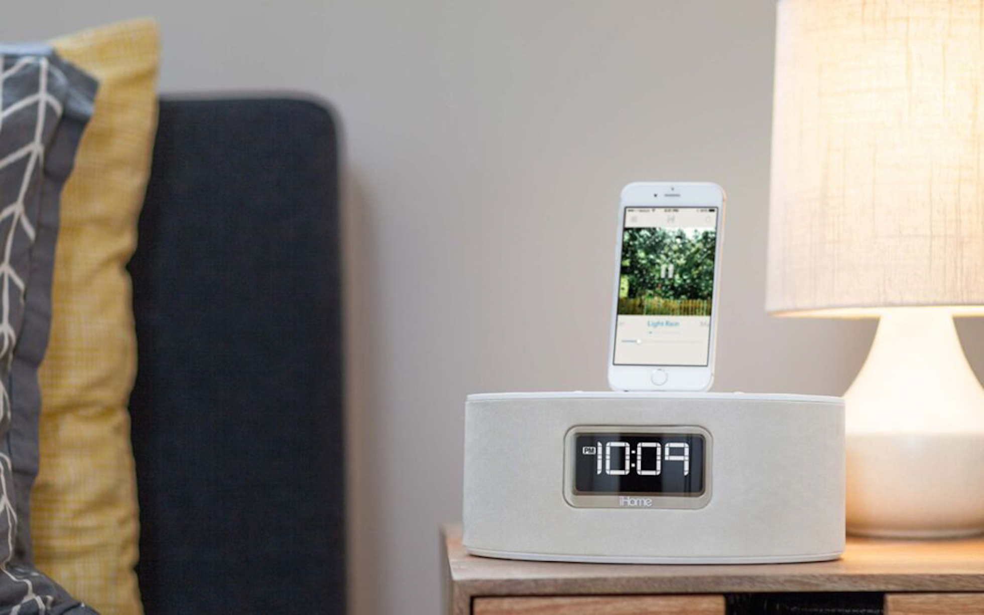
iHome products are great bedfellows of apps like iHome Zen, produced by Mobelux.
In charge of this elusive product’s development, Micah Collins was also a devoted Tumblr user and, consequently, had been spending a whole lot of his free time on the Tumblr mobile app we’d created. After struggling for awhile with the third-party vendor they’d been working with on the alarm clock app idea, Micah kept coming back to how downright pleasant it was to use the Tumblr app—a streamlined, effortless, and beautiful experience. That’s what he wanted for this new product.
So he came and got it from us.
Are you there, Software? It’s me, Hardware.
The 2008 version of Mobelux was very tiny, a four-person operation that was driven simply out of a shared desire to create cool things. When Micah asked, “What could Mobelux do for an alarm clock app?” it was the first time we’d ever considered tinkering with hardware. And we had to start learning it quickly, because Micah literally put a breadboard into our hands and told us to get moving. He said it in much nicer terms than that, but, in a nutshell, the gist was that we were being given free rein to think about how we would establish the alarm clock user experience forevermore.
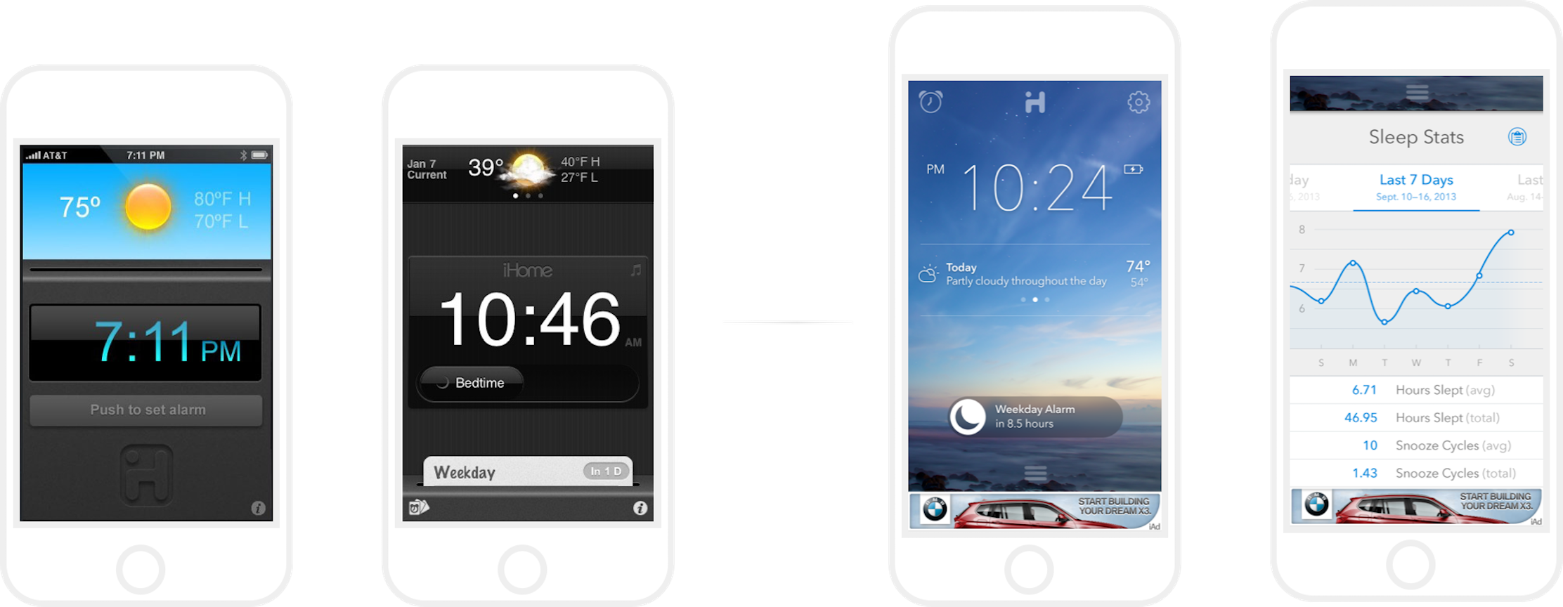
Our first comps six years ago, to what the iHome app looks like now.
Alarmingly Cool
What do you think would be a great bedside alarm clock experience? Nowadays, it’s easier to say, because mobile alarm clocks are an established part of how we use technology in our daily lives. Back in 2008, it was trickier. We started from scratch, heading north to New Jersey and pitching Micah and his team a slew of ideas. Once we settled on a path forward, we iterated and iterated and iterated, always incorporating the options and interactivity they had on their wishlist, but for the most part coming up with the look, the feel, the features, the whole shebang.

To us, a truly custom experience extends all the way to Sleep’s weather forecast iconography.
It soon became clear that this product wasn’t just an alarm clock app (even a really cool alarm clock app that communicated with hardware)—it was an entire sleep experience.
And six years later, not much has changed. Sleep is still iHome’s top-grossing app, and it helped land them a spot among top tech innovators who have brought hardware and software together in a new way. The core of the app was so solidly designed and built that it’s gone on to influence a whole segment of the industry.
We’re pretty proud of that.
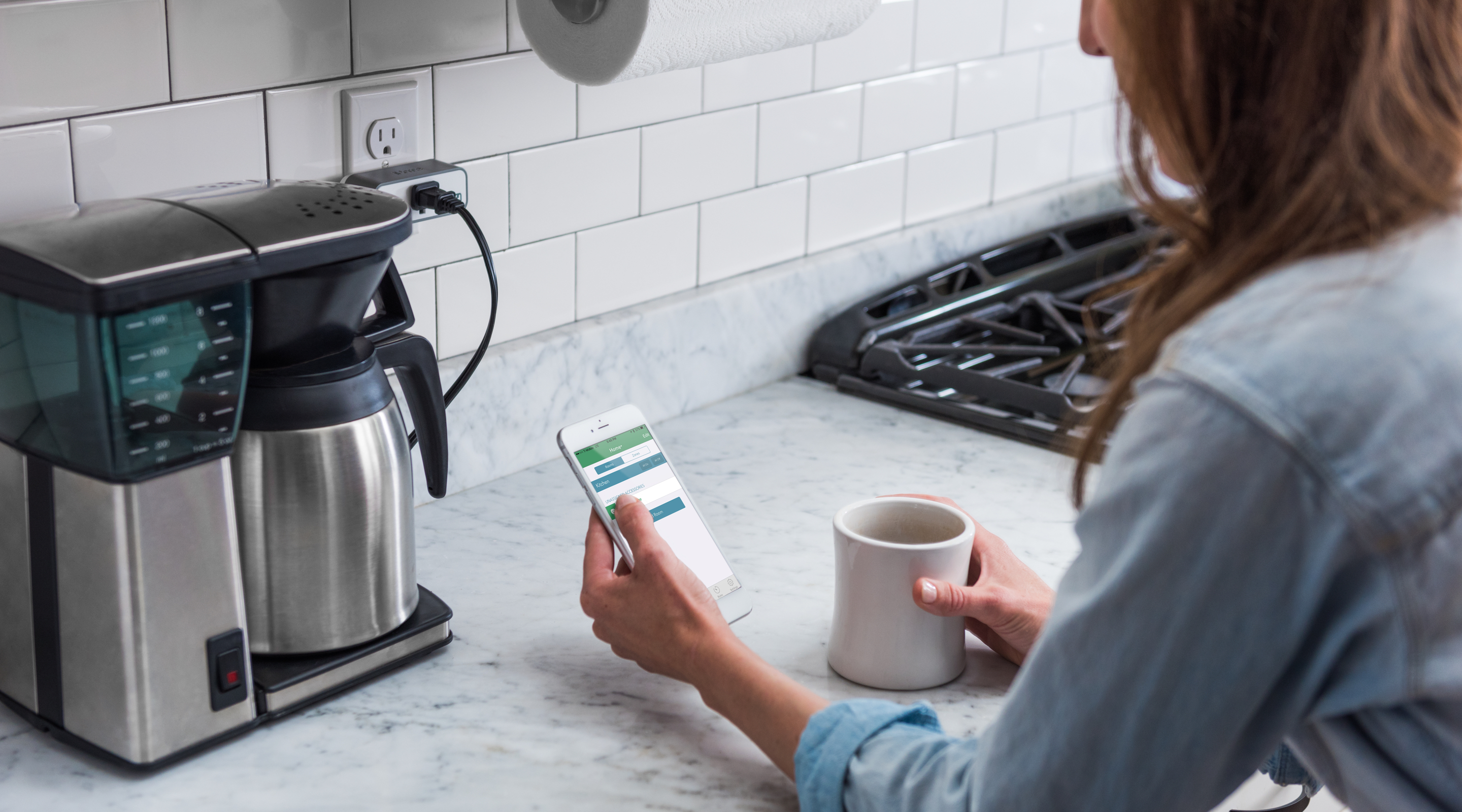
Always innovating, iHome’s latest line allows you control of your home’s devices—from anywhere.
Partnering Up
That was just the beginning of our symbiotic relationship with iHome. When Sean Chraime, Director of Product Execution, wanted to take iHome’s website to the next level, he convinced Mobelux that web belonged in our future. We’d never set our sights outside of mobile, but Sean wanted us to apply the same enthusiasm and analytical eye to their site’s current challenges. After all, he pointed out, we didn’t think we’d ever work with hardware before we tackled Sleep. So why not expand our horizons even further?
Well, when you put it that way…
MOBELUX BROUGHT A WILLINGNESS AND ABILITY TO TRULY LEARN ABOUT IHOME’S NEEDS AND GROW WITH US, ALL WHILE INJECTING A HEALTHY AMOUNT OF INGENUITY TO THE CHALLENGE.
Sean Chraime
IHOME
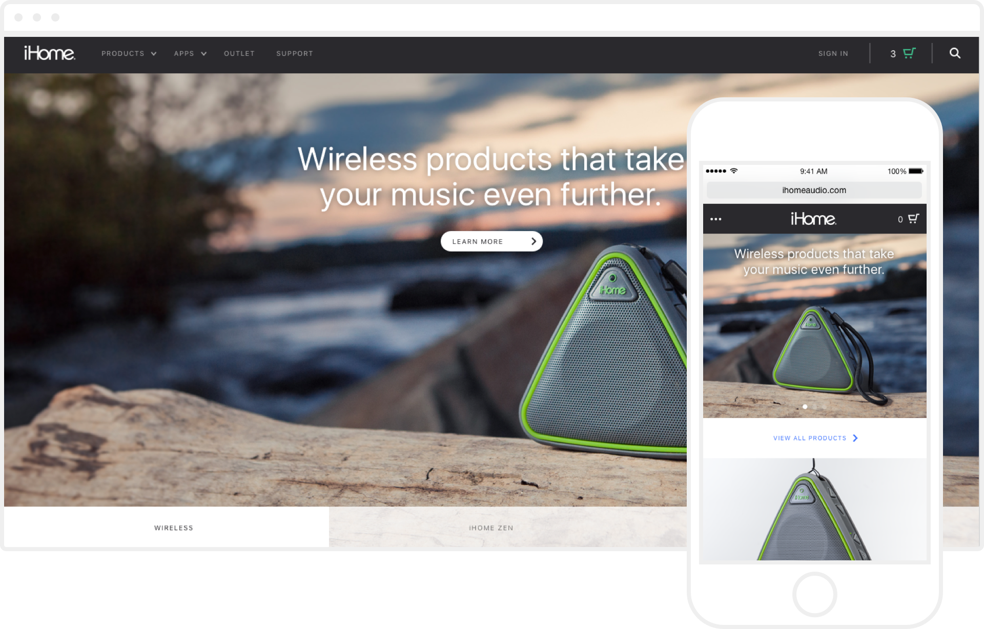
The new, mobile-ready homepage of iHomeaudio.com.
Renovating iHome’s Web Home
iHome’s parent company, SDI Technologies, had a bit of a problem on their virtual hands.
The iHome site had a unique set of challenges: difficult UI, poor-quality imagery, a confusing navigation, and faulty e-commerce. Not to mention that they were running Timex, Kid Designs, and Hotel Technologies in addition to iHome. The web presence was, in a word, scattered.
We took it all apart and put something new together. In less than six months, we had a CMS that integrated across SDI’s multiple business initiatives, tools to help them make sure everything was running smoothly, and a full custom e-commerce redesign and back-end integrated system for their internal ordering processes. Plus, their new microsites represented their brand partnerships better, way better.
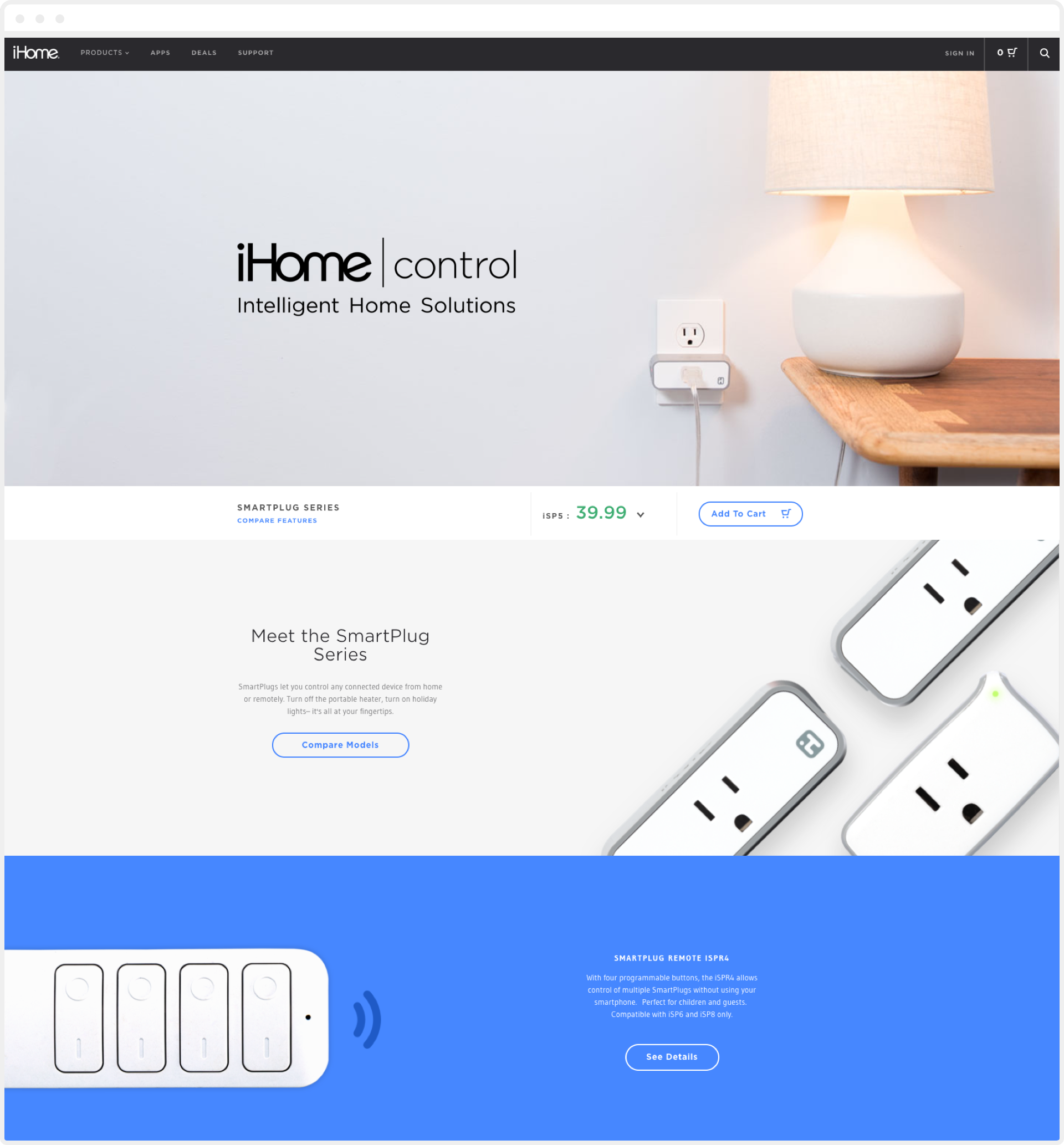
Product lines now feature more immersive marketing experiences.
When iHome’s products started showing up on the Today show, we were introduced to the effects of a fantastic PR opportunity. We learned from that experience how exactly to scale a site to support those kinds of traffic spikes.
Pageviews after Today Show Coverage
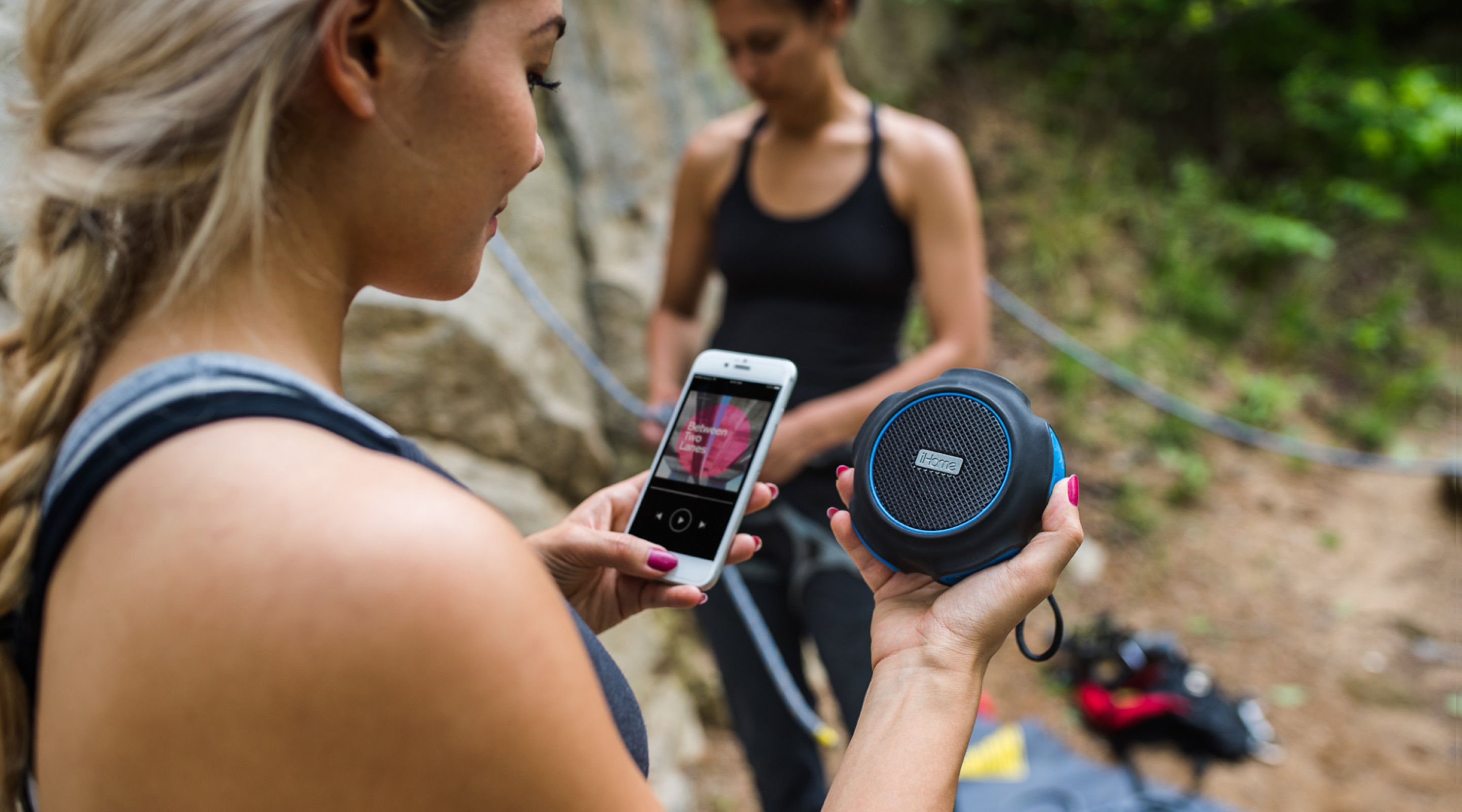
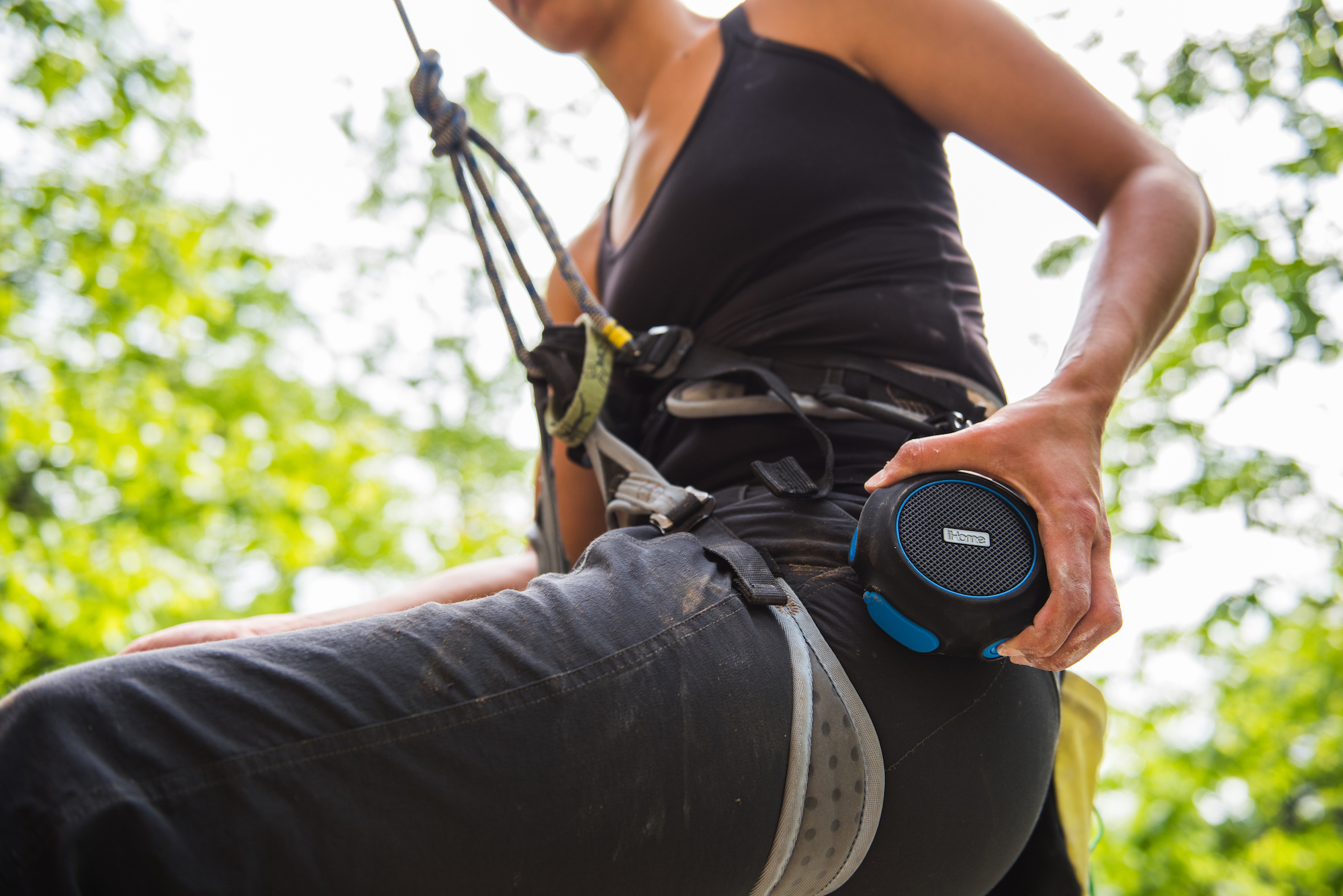
iHome pairs speakers with phones and our technical talents with their hardware.
Aside from iHome Sleep (which had 1.7 million impressions in its first month) and the souped-up website (which upped revenue by a whopping 90.72% in the first eight months), we went on to build iHome Set; our first co-licensed product, iHome Zen; and the Marvel and Star Wars Creativity Studios. They were also among the first clients to ask us for custom photography, which allowed us to broaden our portfolio. Now, we’ve expanded our photography talents into an entire Production department that supports iHome as well as a number of other clients.
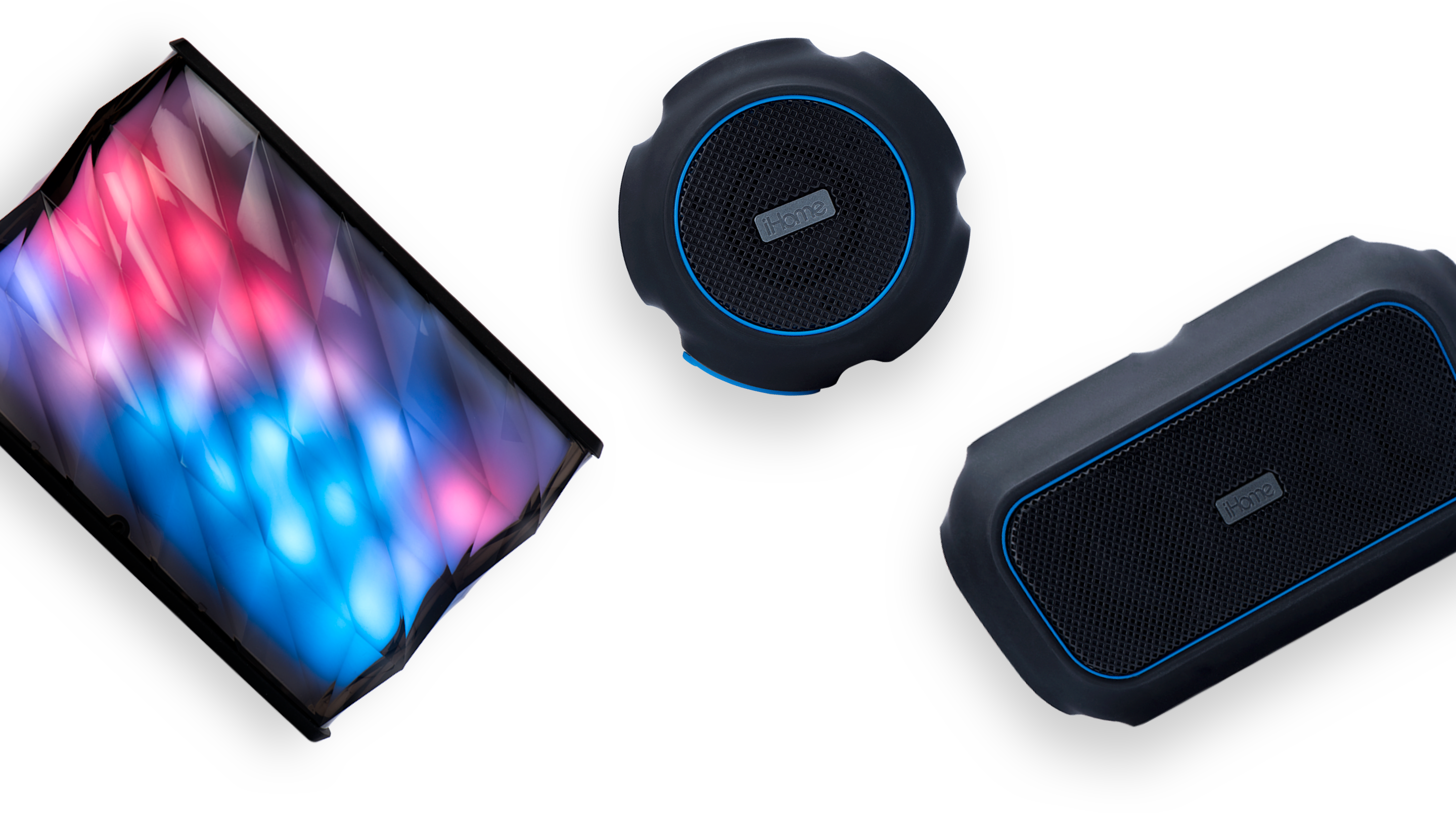
We got our start in studio product photography with iHome
Where will the iHome + Mobelux partnership go from here? Most likely, we’ll continue to break ground together and work on reimagining the way that technology can get them to where they want to go.

