Mobelux Provided:
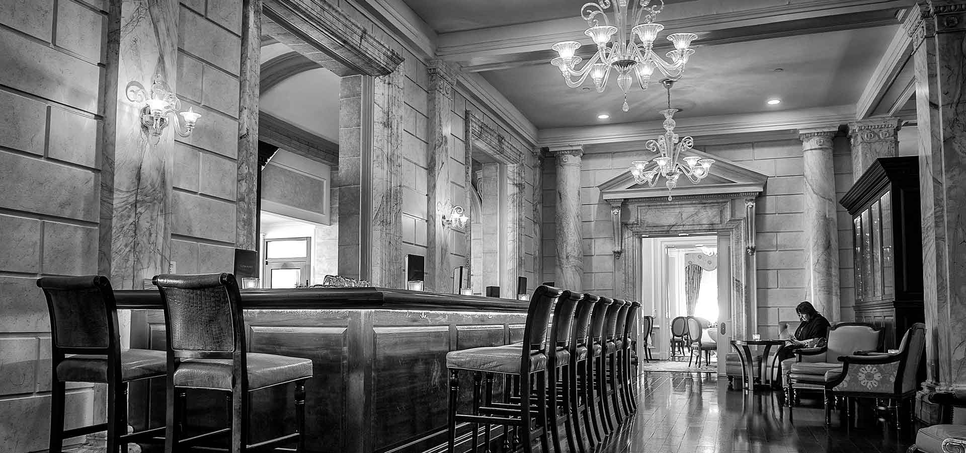
Sitting at the bar of The Jefferson Hotel during cocktail hour, Marc was about to drop three bombshells on me. The first was that he was leaving Tumblr, where he had served as VP of Support for six years. The second, that he and his wife were uprooting from Richmond and moving to Switzerland. I wasn't completely sure if I wanted to hear what the third one was, but after taking a sip of his martini Marc continued anyway. He had an idea for a startup and he wanted to know what I thought about it.
“I want to build a community website that helps people find the best cocktail bar in a given city, whether they've just arrived or they've lived there for years. I have a great name. And I want Mobelux to make it.”

Lemaire at the Jefferson Hotel in Richmond, VA
When Marc pitched his idea for Elixr I wasn't immediately sold. It seemed a bit niche. Yet, it was still interesting (and it was a _superb_name). I was always on the lookout for drink programs that were well-crafted, and as anyone who's ordered an Old Fashioned and received a fizzy, ice-chip-laden, cherry-topped abomination can attest, finding a good bar is tough. An enthusiast community where you could talk to people about the best bar and drink in a city could be handy for people who traveled. After a cocktail or two he asked me to think about it and get back to him.
Discovering the best drinks in the world would remain the goal, but the mechanism to find it would change. The biggest realignment was that we would hinge the concept around the check-in. By allowing people to check-in on a drink they would capture and share that experience with friends while simultaneously building out the drink menus of the venues they patronize. Instead of a website it would be an app so that it would be easier to check-in on the spot. And it would let people check-in on any drink. Beer, wine, cocktails and spirits. The more the better.
After a few more conversations (and maybe another martini or two) it was settled. We turned the project on and got to work designing Elixr.
Building Elixr
After nailing down the core product and breaking it into user stories the design team split into two parts: identity and interface. The identity team worked through dozens of roughs and iterated on the good ideas, drawing particular inspiration from the slender forms and lengthened x-heights of Deco-era signage. After weeks of refinement they fully developed a mark, palette and typeface that we felt represented the brand well.
I’ve had an exceptionally positive experience with Mobelux and would highly recommend their services to anyone seeking a development partner.
Marc LaFountain
ELIXR

Logotype & Illustrations for the Original Elixr Launch
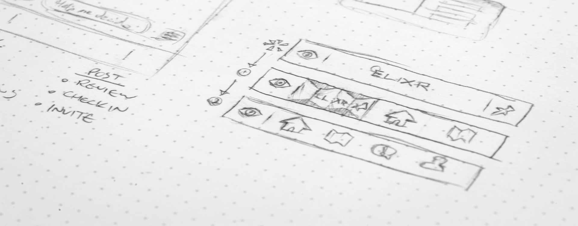
While the identity was being nailed down we worked feverishly on the user interface (UI) and user experience (UX). The interface design process at Mobelux is at the heart of what we do, and it began as it usually does: with a whiteboard. Even the most outlandish UI and UX concepts for Elixr were fair game. Over days the ideas were weeded, refined and tempered until we felt like we had something that provided enough depth to accomodate the product.

Sketches of Some Early Interface Concepts
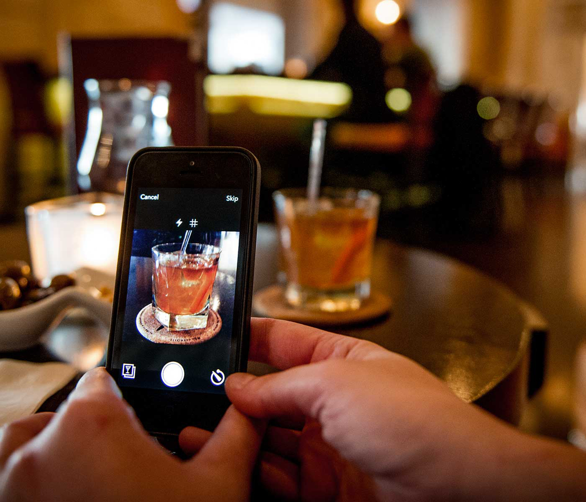
The check-in process was one of the most challenging aspects to design. The check-in experience was centered around taking a photo of your drink before entering information about it. After a few protoytpes and a half-dozen conversations we ended up building a custom photo capture solution that would work in even the darkest corner of a bar.
As the days went on we honed every one of Elixr's views until they all exuded the same level of polish. We built spring dynamics into table headers to give Elixr more character and tuned the photo filters until they felt just right. Finally, with an interface and identity we were proud of, core development could start.
Launch Day
After 5 months of designing, developing and testing we released Elixr 1.0 on March 14, 2013. We were all glued to Barman (Elixr's hard-working admin console) with beers in hand as Elixr went live on the App Store. The first post came through. We toasted to Elixr and watched as a Budweiser at a TGIFridays in India became the first official check-in. Not exactly the beer I would have chosen, but all the same, seeing people on Elixr for the first time was magical.
Over the next 24 hours we watched as our hometown of Richmond, Virginia was covered with check-in pins. Members from around the world commented, liked and followed one another. Venues with the best tap lists and bar programs around the US started popping up. We knew that we were onto something, even if we weren't sure where it would go. New York started getting filled out, as did San Francisco. We were, for some reason, big in Vancouver. We didn't get too long to celebrate though. Cupertino had other plans.
2.0
Starting over can be liberating. Or frightening. Or both simultaneously. In June of 2013, just three months after we launched, Apple previewed iOS 7 at WWDC for the first time. In just one hour they completely redefined the iOS experience around content and away from ornate interfaces. Introduced depth, a new focus on motion and discouraged unnecessary visual weight. By the end of the keynote what needed to be done was obvious to everyone on the Elixr team. In order to make Elixr a first-class citizen on the iPhone we had to start over.

2.0 Branding for Elixr
Well, mostly anyway. Much of the magic behind Elixr was in the platform that we wrote, so we could focus our time on the app experiences. On iOS we focused on clarity and intent. We scrubbed away all the textures and fussy controls. Ultimately we distilled the experience down to a simple navigation concept that showcased edge-to-edge content while keeping the check-in at the heart of the experience. We added to-dos, history and an all-encompassing search feature. iOS 7 allowed us to refocus on the core of the product and leave the filigree behind. And after we had rebuilt the iOS app, we built a stellar Android app to match.
When Elixr 2.0 shipped on December 12, 2013 we again waited for midnight and watched as members both new and old, on iOS and Android, shared their favorite drinks with friends and added drinks to shiny new to-do lists. They searched for their favorite breweries and chose a places to meet up with friends. And for the second time that year, the team toasted Elixr as we watched someone enjoy another Budweiser in India. To each their own, I suppose.

