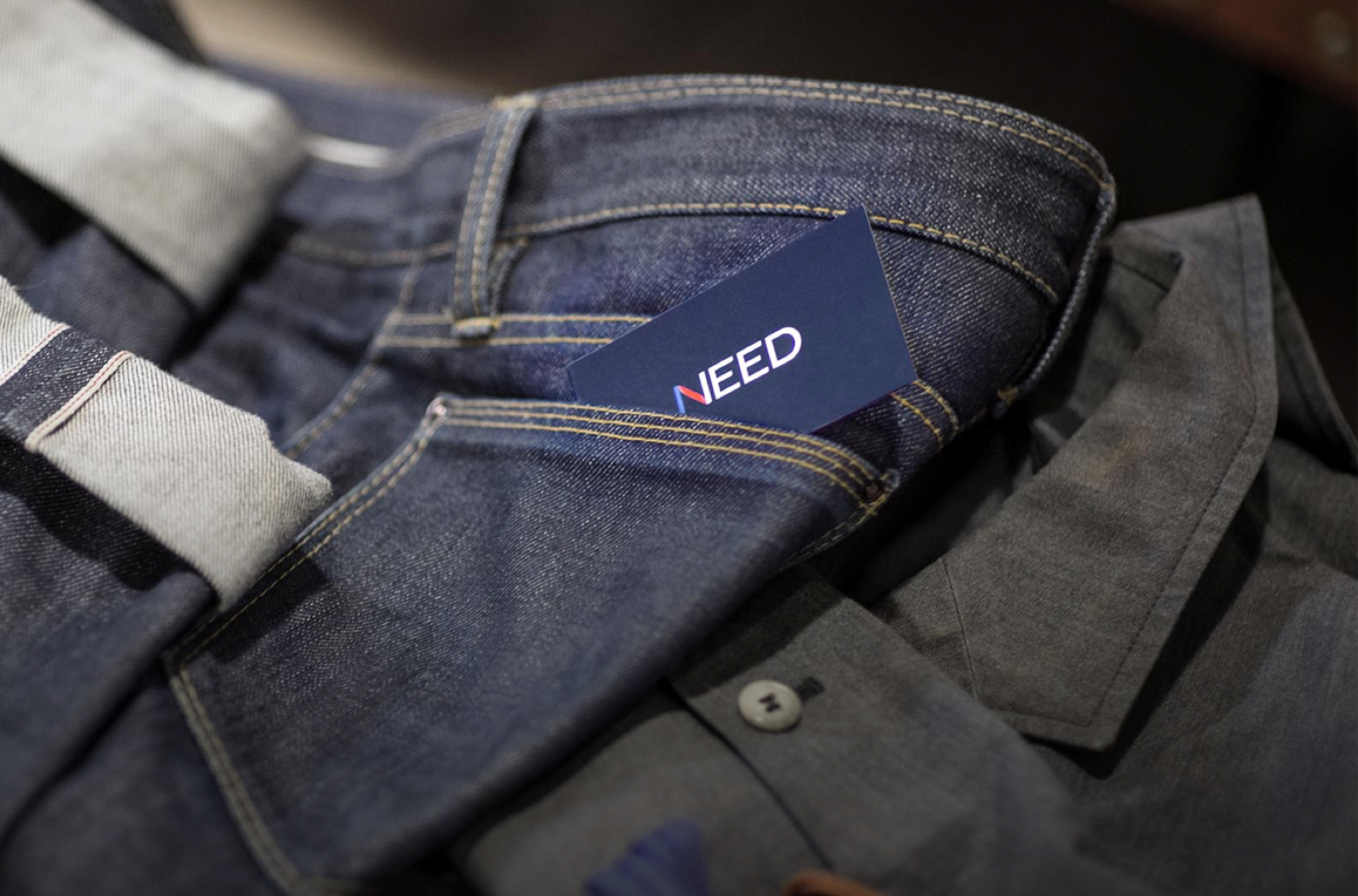
Mobelux Provided:
In early 2013, Mobelux got an email from Matt Alexander wondering if we could help him build an app that was a hybrid between a retail platform and a digital publication. The idea was intriguing, but honestly, so was the idea of working with Matt. We knew of Matt from his blog, OneThirtySeven and as co-host of Bionic, a popular 5by5 podcast about tech, Britishness, humor, and, well, just about anything.
The primary goal of Matt's new company was to help men stay fashionable without the burdensome experience of endlessly shopping. For most men, finding high quality products is an inconvenient and time consuming task. Matt wanted to curate a destination for fashionable, classic clothing and accessories under a central theme, delivered monthly. His guidance was simple; great writing and stylish photography of stellar products in an editorial layout. A magazine that you could buy from directly.
Initially, we were not tasked with the design of the Need company logo and identity. But since it hadn't been started yet and we had a few ideas, we asked Matt if he wouldn't mind seeing a few concepts. He agreed, so we worked up a few comps and presented him not only logo and icon ideas, but also how that style could be reflected throughout the whole product.
The main challenge with Need's logo was that it had to fulfill a lot of criteria beyond just being beautiful. It had to feel classic and exude a touch of Texas charm. It would also have to stand on its own while complimenting a wide mix of strong product brands.
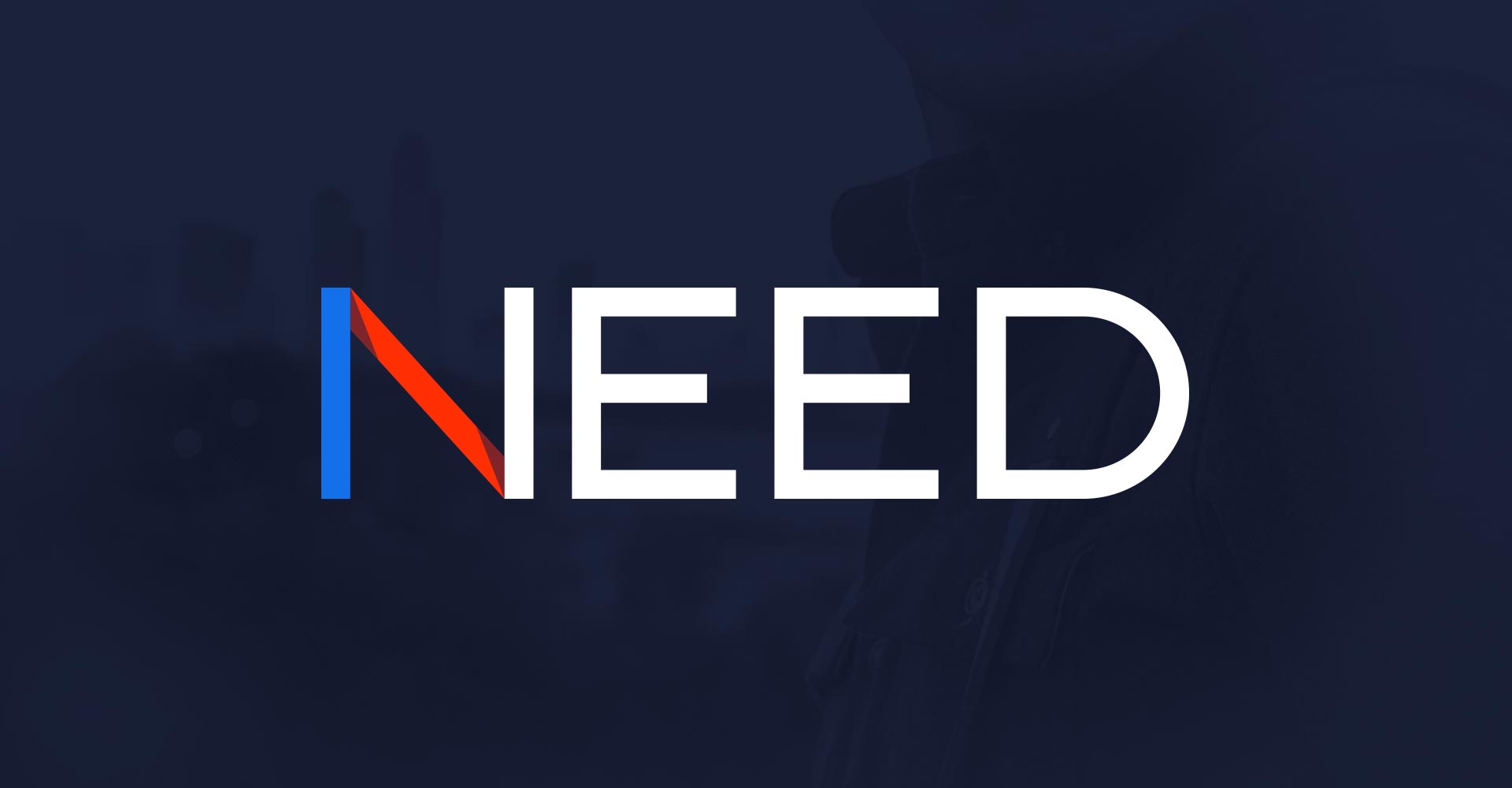
The Need Logotype
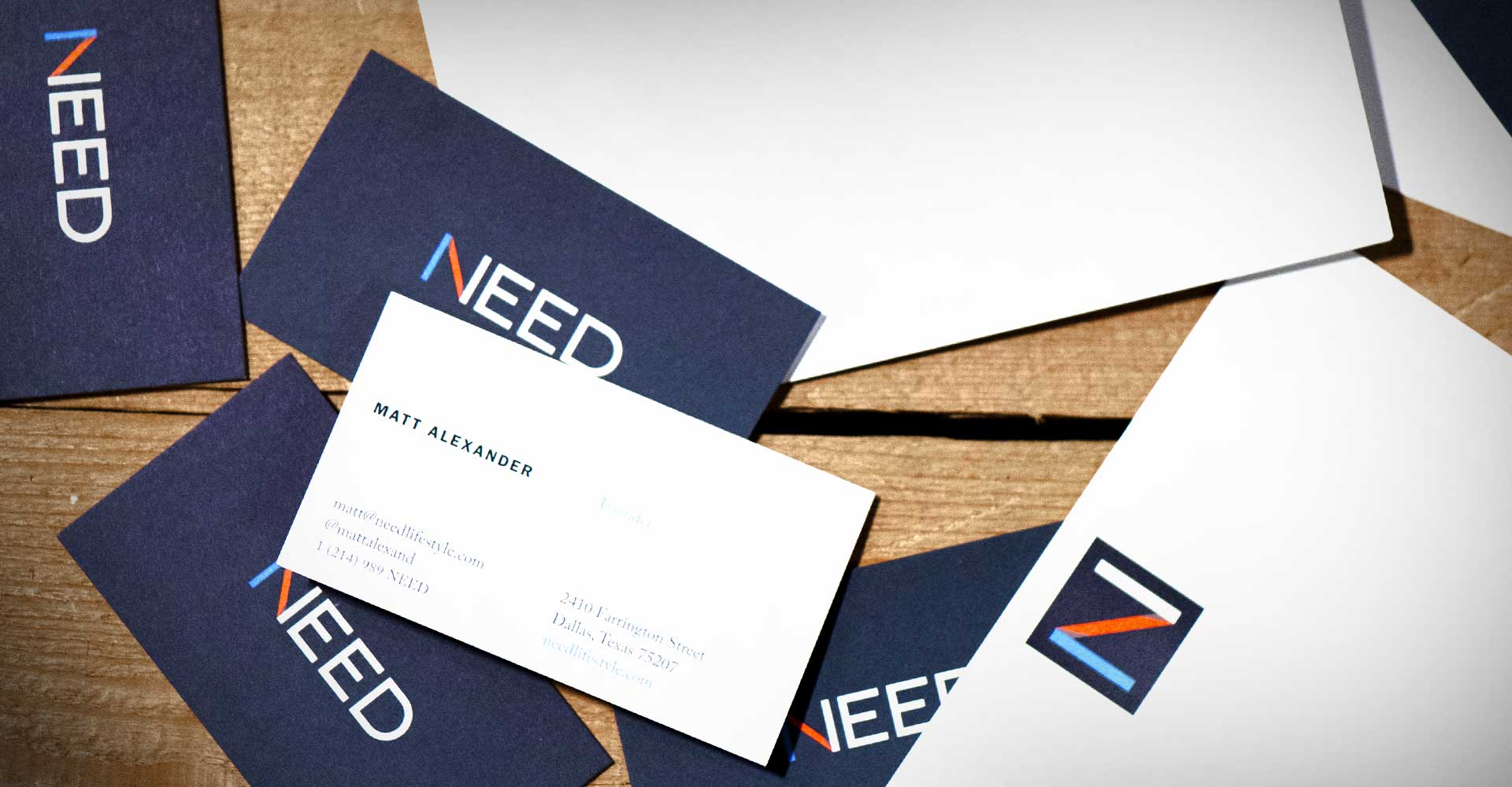
Need Business Cards and Note Cards
To further extend the identity, a suite of custom icons were crafted to reinforce Need's unique offering in the market. We envisioned them leading off each product photography section and standing for the content expected beneath, whether that was "Shirts", "Timepieces" or "Trousers" (Matt's British heritage makes him allergic to calling them pants).
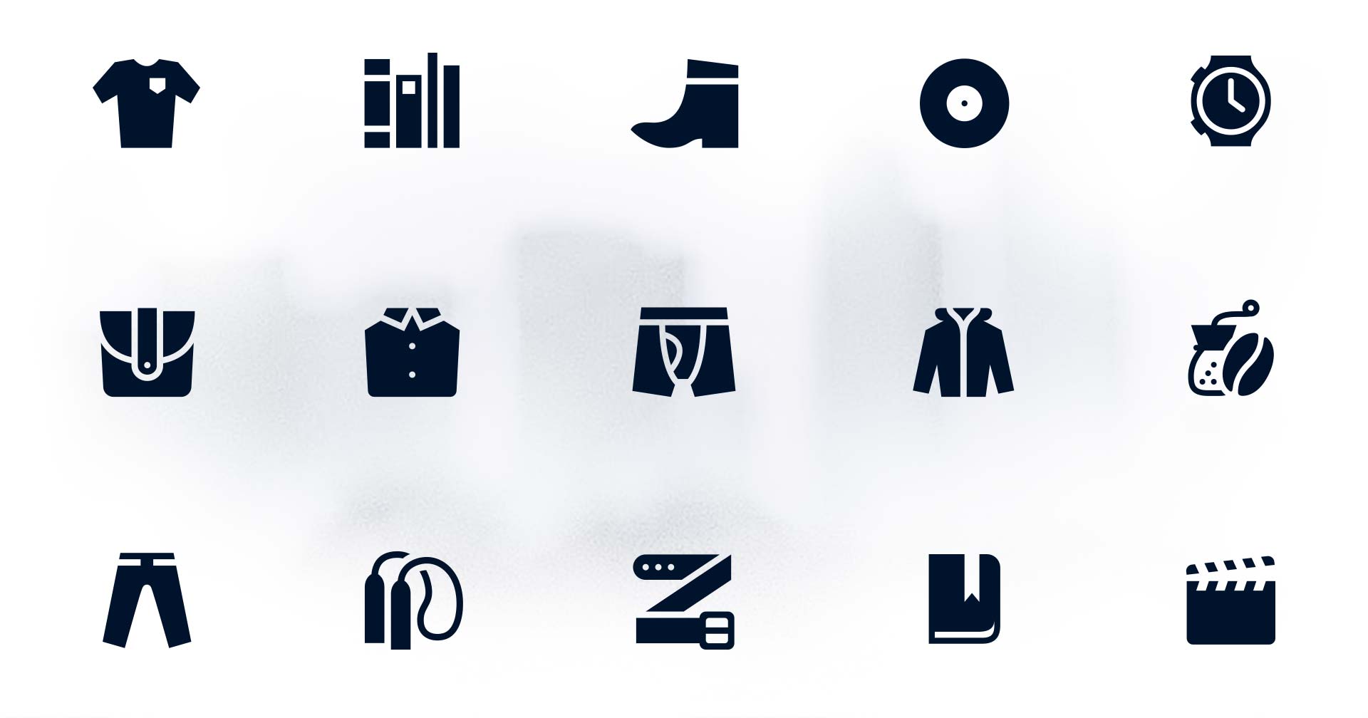
Custom Icon Set for Product Categories
I’ve had an exceptionally positive experience with Mobelux and would highly recommend their services to anyone seeking a development partner.
Matt Alexander
NEED
To rent or to buy
Need required much more than great design. We had to develop an interface that would work great whether you were clicking or tapping on it. It was key to the product strategy that Need feel as natural on an iPhone or iPad as it did in a desktop browser. Since Matt's original vision was for Need to debut as an app, we decided to design a mobile-first responsive front end and scale the design up to desktop, a pattern that might seem to go against mainstream logic, but in this case ensured that all mobile use cases were well accounted for.
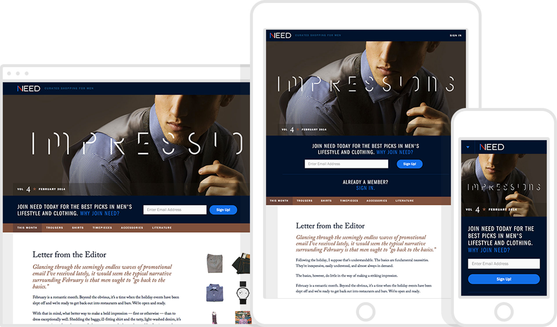
Need's Responsive Interface
Launch
Work progressed, wireframes turned into interfaces and Need started to take shape. Through rapid iteration and consistent, honest communication we shipped feature after feature until the parts began to resemble the whole. That last month of development was a whirlwind of product photographs and copy editing, but we were driven to get Need in front of people for the Christmas shopping season. While we were busy building Need, Matt was busy forging relationships with some great brands and had recruited a top-notch photographer for the inaugural shoot. On November 5th, 2013, Vol. 1 of Need went live.
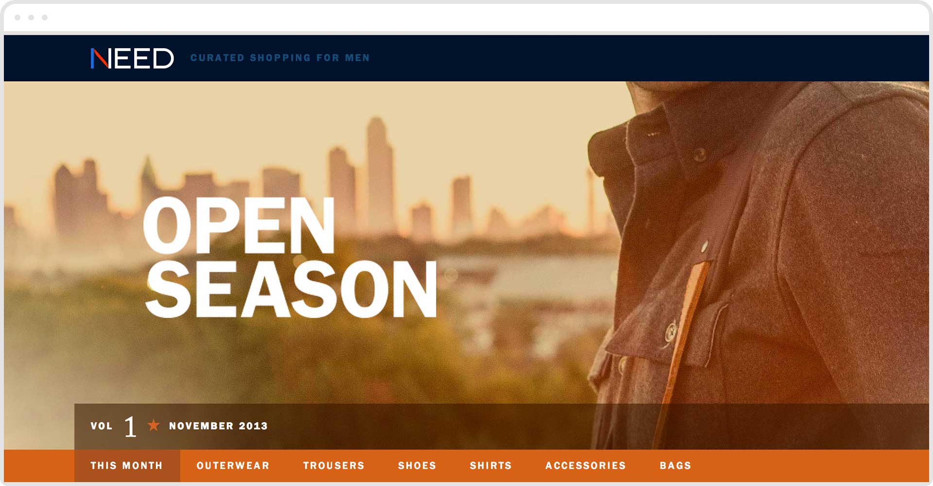
Need Volume 1 Banner
Need, as many of the products that Mobelux partners on, is a story still being told. With every volume we continue maintaining and expanding the concept alongside Matt, bringing it ever closer to its potential. We add and subtract. Redirect and refine. All towards a common goal of crafting an exceptional, approachable shopping platform for the 21st century. After all, those trousers aren't going to just sell themselves, now are they?

